How Color Impacts Home Organization
- Contact QueenBee
- Sep 1
- 11 min read
Updated: Oct 5
Color isn’t just decoration - it’s a tool that can help you stay organized. By choosing colors that match the purpose of each room, you can make your home more functional and inviting. Here’s what you need to know:
Colors influence mood and focus: Energizing hues like yellow work well in kitchens, while calming tones like blue or lavender are ideal for bedrooms.
Light and dark shades affect space: Light colors make small areas feel bigger, while darker tones create defined zones in larger rooms.
Color-coded systems simplify organization: Assign colors to categories (e.g., red bins for holiday decor, green folders for finances) for easy navigation.
Match colors to your lifestyle: Pick shades that align with your habits, lighting, and long-term needs.
Using color strategically not only makes spaces more organized but also supports how you live and feel in your home.
Lori Sawaya: How to Organize Home With Colors | Room by Room #10
The Science Behind Color in Home Organization
Color isn't just about aesthetics - it plays a crucial role in how we feel and interact with our surroundings. Research reveals that our perception of color can influence emotions, productivity, and even how we experience space. Understanding these effects can help you make smarter choices when organizing your home.
How Color Impacts Mood and Productivity
The colors in your home can do more than just brighten a room - they can shape how you feel and perform daily tasks. For example, certain hues can energize you, while others promote calmness. By aligning color choices with the purpose of a space, you can enhance its functionality. Imagine a vibrant shade for a home office to boost focus or a soothing tone for a bedroom to encourage relaxation. This thoughtful use of color can support your routines and make your spaces work better for you.
Color and Visual Space
Color also has the power to change how we perceive the size and layout of a room. Lighter shades, for instance, reflect more light, creating the illusion of a larger, airier space. This makes them a great choice for storage areas, where a sense of openness can make it easier to organize and find items.
On the flip side, darker hues absorb light, giving a room a cozier, more intimate feel. This can be especially useful in larger rooms where you want to create distinct zones for different storage needs. By carefully choosing light or dark tones, you can shape how a space feels while improving its functionality.
But it doesn’t stop there - color temperature adds another layer of influence. Warm tones, like reds and oranges, tend to "advance", making walls appear closer. Cool tones, such as blues and greens, "recede", creating the impression of more space. As The Interior Design Institute explains:
"Warm colors tend to advance, making them ideal for accent walls that you wish to visually pull towards you. Cool colors, on the other hand, recede, pushing walls away and expanding the perceived space."
This visual trick, known as the illusion of depth, can be a game-changer. For example, painting the back wall of a deep closet in a cool, light color can make it feel more spacious. Adding warm accents to items like bins or labels can make them stand out, helping you locate things quickly.
It’s also worth noting that color perception can vary depending on lighting, surrounding colors, and even the angle from which you view it. That’s why it’s smart to test your chosen colors in the actual space before committing. By applying these scientific principles, you can use color not just to beautify your home but to make it more organized and functional.
Picking Colors for Different Rooms
Every room in your home has its own purpose, and the colors you choose should align with how you use each space. Colors can influence mood and energy, so it’s important to match their psychological effects with the atmosphere you want to create. For example, the vibrant energy you might want in a kitchen may not work for a serene bedroom. Let’s take a closer look at how to select colors for your kitchen, home office, and spaces meant for relaxation.
Kitchen: Energizing and Welcoming Colors
The kitchen is often the heart of the home, so it benefits from colors that energize and invite connection. Yellow is a great choice - it’s known to stimulate appetite and encourage social interaction, making meal prep and family dinners more enjoyable.
Green, particularly shades like sage or mint, is another fantastic option. It brings a fresh, clean vibe to the space and is easy on the eyes, which is especially helpful during long cooking sessions.
To bring these colors into your kitchen, try painting pantry shelves in a cheerful yellow for better visibility, adding green accents to glass containers for a fresh touch, or incorporating subtle orange tones in your kitchen tools. Pair these vibrant hues with neutral elements to keep the space balanced and functional.
Home Office: Colors That Support Focus
Unlike the kitchen, a home office thrives on calm, focused energy. Blue is a top pick for this space - it promotes mental clarity and reduces stress. Light blue walls can make the room feel more open, while navy accents add a touch of sophistication without being overwhelming.
Green is another strong contender, particularly in muted tones like forest or olive. These shades are gentle on the eyes, making them ideal for long hours at a computer, and they help create a balanced, focused environment.
To incorporate these colors, consider blue file folders or sage green storage boxes to keep your workspace organized and visually calming. A navy bulletin board can add a sense of structure without being distracting. Avoid red, as it can increase anxiety, but if you want a touch of brightness, subtle yellow accents can provide a gentle boost. Thoughtful color choices like these can help transform your home office into a space that enhances productivity and focus.
Living Room and Bedroom: Relaxing and Soothing Colors
For areas meant for unwinding, such as the living room and bedroom, it’s all about creating a sense of calm. Soft blues are perfect for this - they help ease the mind and transition you from the stress of the day to a more relaxed evening. Neutral tones like warm gray, beige, and cream provide a soothing backdrop that pairs well with furniture and helps disguise minor clutter.
In the bedroom, consider hues like lavender or pale purple. These colors promote relaxation and are ideal for creating a peaceful atmosphere conducive to sleep.
To enhance the calming effect, choose storage solutions that blend seamlessly with your palette. Natural-tone baskets work well in living rooms, while soft gray ottomans are a great option for bedrooms. Add subtle pops of color, like sage green or soft coral, to keep the space visually interesting without overwhelming its tranquility.
Keep in mind that lighting can dramatically affect how colors look throughout the day. Always test your chosen shades in both natural daylight and evening lighting to ensure they create the desired effect in every setting.
How to Use Color in Home Organization
Once you've picked out color palettes for each room, you can use them to blend style with function. By weaving your chosen colors into organizational systems, you can streamline daily routines while keeping your decor cohesive. The right use of color can turn storage into a design feature, making your home both practical and visually appealing.
Color-Coded Storage Systems
Color-coding is a simple yet powerful way to organize your space. Assigning specific colors to categories makes it easy to find what you need at a glance.
Focus on high-traffic areas like your home office or kitchen pantry. For example, in your office, you might use blue folders for financial documents, green for household information, and yellow for work-related papers. In the kitchen, color-coded containers can simplify meal prep: red containers for proteins, green for vegetables, and clear or white for grains and pantry staples. For chaotic spaces like junk drawers or kids' playrooms, sticking to a single color can unify the look and reduce visual clutter.
Accent Walls and Decorations
Color can also work beyond storage to enhance organization through wall treatments and decor. Well-placed colors on walls or in decorative items can reinforce the room's purpose while keeping things organized. For instance, a soft indigo accent wall in your home office can create a calming, focused atmosphere without adding unnecessary distractions.
Decorative pieces can serve dual purposes. A sage green bulletin board in your office can keep notes and schedules in order while adding a touch of style. Similarly, natural-tone baskets in the living room provide storage while blending seamlessly into your color scheme.
Matching Style with Function
The best color systems balance practicality with your personal taste. Your home should reflect your personality and lifestyle while staying functional. If you thrive in a high-energy environment but prefer a clean, uncluttered look, a simpler color palette might work best to avoid overstimulation.
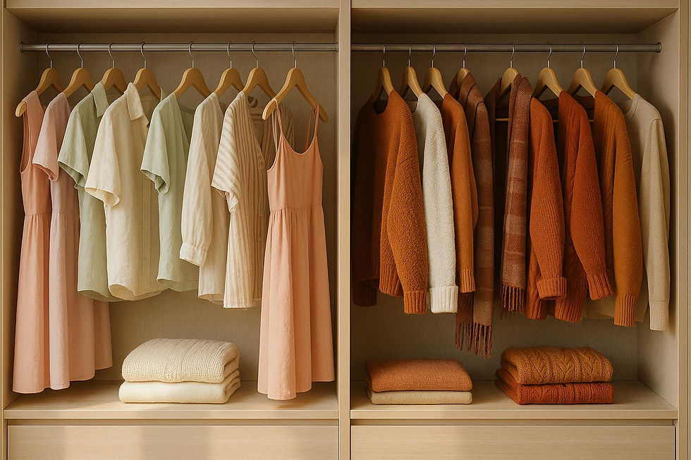
Start by identifying colors you naturally gravitate toward. Your wardrobe can be a great source of inspiration - if you often wear navy and cream, those shades can translate beautifully into your home’s organizational system, creating a unified and harmonious vibe.
To maintain balance, try the 60-30-10 rule: dedicate 60% of your palette to dominant elements like walls, 30% to secondary features like furniture or larger storage units, and 10% to accents such as smaller containers or labels. Combining warm tones (like oranges and yellows) with cool tones (like blues and greens) can make your space feel welcoming without being overwhelming.
Start small - focus on one area first. Once you've perfected your system there, expand it to other parts of your home for a consistent, organized look.
Customizing Color Choices for Long-Term Organization
When it comes to organizing your home, choosing colors isn't just about aesthetics - it’s about creating systems that work seamlessly with your lifestyle and stand the test of time. A well-thought-out color scheme can keep your space functional and adaptable as your needs evolve.
Matching Colors to Your Lifestyle
Your color choices should align with how you live day to day. For instance, if you’re a morning person, warm tones like yellows and oranges can energize your kitchen or workspace during those early hours. On the other hand, night owls might find cool blues and purples more soothing during their peak evening productivity. If you have young kids, medium-toned blues, greens, or grays can help hide wear and tear while still looking polished.
Think ahead, too. Families planning to grow might benefit from neutral base colors paired with accents that can be updated easily as their needs change. If retirement is on the horizon, you may want to lean toward timeless, elegant tones rather than trendy colors that could feel outdated down the line.
Don’t forget to factor in lighting and upkeep. Darker shades work well in high-traffic areas where maintenance needs to stay low. North-facing rooms, which tend to get cooler light, can handle warmer colors without feeling stark, while sun-filled south-facing spaces might benefit from cooler tones to balance the brightness. If bold, bright colors leave you feeling drained after a long day, opt for darker blues, greens, or rich browns - they’re calming and tend to age gracefully.
By tailoring your color choices to your lifestyle, lighting, and long-term goals, you can create an organization system that feels both personal and practical.
Working with Professional Organizers
If you want a system that’s both stylish and functional, partnering with a professional organizer can make all the difference. Companies like Queen Bee Organizers specialize in creating personalized solutions that balance design with usability. Their expertise ensures your color choices enhance your routines rather than complicate them.
Professional organizers bring a fresh perspective to your space. They can analyze your habits, preferences, and room layouts to suggest color systems you might not have considered. For example, they might recommend using varying shades within the same color family to create a cohesive look while keeping categories visually distinct - a technique that requires experience to pull off effectively.
But their services go beyond picking colors. Queen Bee Organizers takes a comprehensive approach, evaluating your existing systems, understanding your household’s unique needs, and designing solutions that grow with you. This expert guidance can help you avoid common pitfalls, like selecting colors that clash with your décor or buying storage products that don’t fit your space.
Investing in professional organizing services often pays off in unexpected ways. You’ll save time and money by avoiding trial-and-error solutions, and you’ll likely notice benefits like reduced stress and improved productivity. Professionals can also address details you might overlook, such as how lighting affects color perception throughout the day or how to create systems that accommodate everyone in the household, including those with specific visual preferences.
With ongoing support from Queen Bee Organizers, you’ll have a system that evolves alongside your life, making organization a natural and effortless part of your daily routine.
Conclusion: Using Color to Transform Your Home Organization
Color isn’t just about making things look pretty - it’s a tool that can shape how you feel and how efficiently you function in your space. By understanding how different colors influence mood and productivity, you can design organization systems that work with your brain, not against it. This approach allows for practical and personalized solutions that fit seamlessly into your lifestyle.
For instance, warm colors like reds and oranges can energize a kitchen or home office, while cooler shades such as blues and greens create a calming atmosphere, perfect for bedrooms or living rooms. Even something as simple as color-coded bins can make finding items quicker and easier. The trick is to align your color choices with how you live. If your days are packed with work, kids, and endless to-dos, you might opt for medium tones that hide wear and tear or choose flexible accent colors that can adapt as your needs change over time.
It’s not just about picking colors you love; it’s about thinking through the details - your lighting, daily habits, and even how you want to feel in different spaces. A color scheme that energizes you in the morning but leaves you overstimulated by evening won’t work long-term. This is where expert advice can make a difference. Professionals like Queen Bee Organizers specialize in blending color psychology with practical solutions, helping you create spaces that stay organized and functional.
Your home should make life easier, not harder. With a thoughtful approach to color, you can design spaces that boost your productivity, lower your stress, and make staying organized feel natural instead of like a chore.
FAQs
How can I use color to organize a small space without making it feel cramped?
To make a small space feel more open and organized, start with light, neutral colors like white, beige, or soft pastels. These tones help reflect light, giving the room a brighter, more spacious vibe. Stick to one consistent color palette to keep the space visually harmonious, and try grouping items by color to create a neat, pulled-together look.
When it comes to storage, you can use bright or bold accents to highlight functional areas without overpowering the room. Think colorful bins or baskets - they not only keep things tidy but also add a touch of personality. Keep in mind, simplicity is key. Minimal and intentional decor will help the space stay clean and uncluttered.
What mistakes should I avoid when choosing colors for organizing my home?
When picking colors for home organization, one pitfall is sticking too much to neutral or monochromatic palettes. Sure, these tones can feel soothing, but they might also leave a room looking flat or uninspired. To liven things up, try introducing complementary or contrasting colors. This adds depth and makes the space visually engaging.
Another common misstep is choosing colors purely based on personal taste without considering lighting and surrounding decor. The way colors look can change drastically under natural versus artificial light. That’s why it’s smart to test color samples in the actual space at different times of the day. This helps ensure the colors blend well with the environment.
By mixing in some variety and testing ahead of time, you can create a space that feels more dynamic, welcoming, and organized - perfect for boosting both your mood and productivity.
How does lighting influence how colors look in a room, and what should I keep in mind when choosing colors for different times of the day?
Lighting has a huge impact on how colors appear in your home. Natural light shifts throughout the day, which means the same color can look completely different depending on the time. For instance, rooms facing north tend to highlight cooler, softer shades, while those facing south often bring out warmer, brighter tones. Artificial lighting also plays a role - warm bulbs (like incandescent or Edison lights) can amplify warm tones, while cooler bulbs (like LEDs or fluorescents) might make colors appear sharper or even subdued.
When deciding on colors, think about how the lighting in your space changes during the day. Take into account how much natural light the room receives, and pair it with artificial lighting that matches the mood you’re aiming for. This way, your space will feel welcoming and well-balanced, no matter the time of day.